Chromatic Chronicle: colour and design
Colour is a visual language and precision tool that transforms spaces. In this blog, we delve into the subtleties of color theory, it’s history and it’s future - unraveling a narrative that's both art and science.
Deciphering Color Theory: The Art of Precision

Foundational Principles: In interior design, color theory is rooted in understanding how different hues interact and affect spatial perception. Warm colors, like reds and yellows, create a sense of warmth and energy, making large rooms feel cozier. Cool colors, such as blues and greens, evoke calmness and can make smaller spaces appear larger. The use of complementary colors (those opposite on the color wheel) can add vibrancy to a space, while analogous colors (those next to each other on the wheel) create a more harmonious and serene environment.
Emotional Impact: Colors significantly influence the mood and ambiance of a room. For instance, blues are often used in bedrooms for their calming effect, while greens, associated with nature, bring a sense of tranquility and rejuvenation, making them ideal for living rooms or studies. Vibrant colors like orange or yellow can stimulate conversation and are suitable for dining or entertainment areas. Understanding the psychological effects of colors allows designers to craft spaces that align with your emotional needs.
Practical Application: In practical terms, color theory guides us in creating a balanced and cohesive interior. Neutral colors often serve as a backdrop, allowing for versatility and flexibility in decor changes. Accent colors can be introduced through accessories, art, or furniture to add character and depth. Lighting, both natural and artificial, also plays a crucial role in how colors are perceived, making it a critical consideration in the color selection process. Effective use of color theory in our work not only enhances aesthetics but also ensures that spaces are adaptable, functional, and reflective of our client’s personalities.
A Look Back to NOW
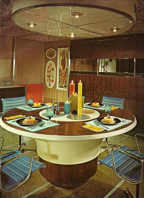
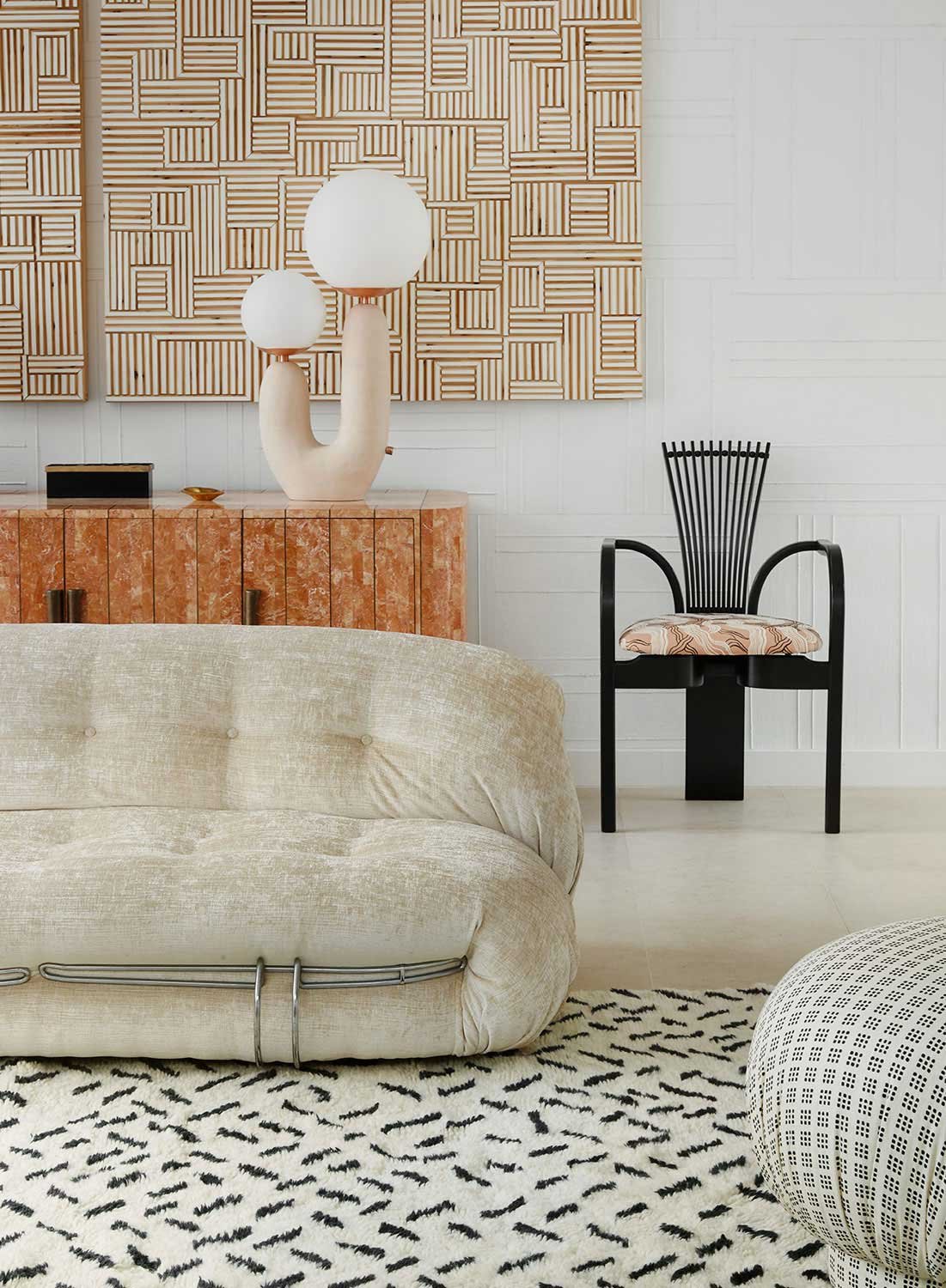
The '70s Revival
Picture the '70s—a canvas of bold choices. Avocado greens, burnt oranges, and harvest gold weren't just trends; they were deliberate expressions of opulence. Today, these hues return with a purpose, speaking to those who demand curated luxury.
'80s Neutrals: Elegance Redefined
The '80s brought neutral tones—a timeless choice in elegant simplicity. Beiges, taupes, and soft pastels persist, a testament to enduring sophistication that transcends trends.
Millennial Pink: Playful Precision
Millennial Pink disrupted norms, a symbol of inclusive luxury. Its playful spirit endures, resonating with those who seek smart, unconventional design.

Foreseeing the Future Palette: A Bold Outlook
Verdant Precision: Nature-Inspired Elegance
Biophilic design takes center stage with a resurgence of nature-inspired greens. Rich emeralds, calming moss tones, and muted sage hues redefine luxury, aligning with a purposeful connection to the natural world.

photo: architectural digest
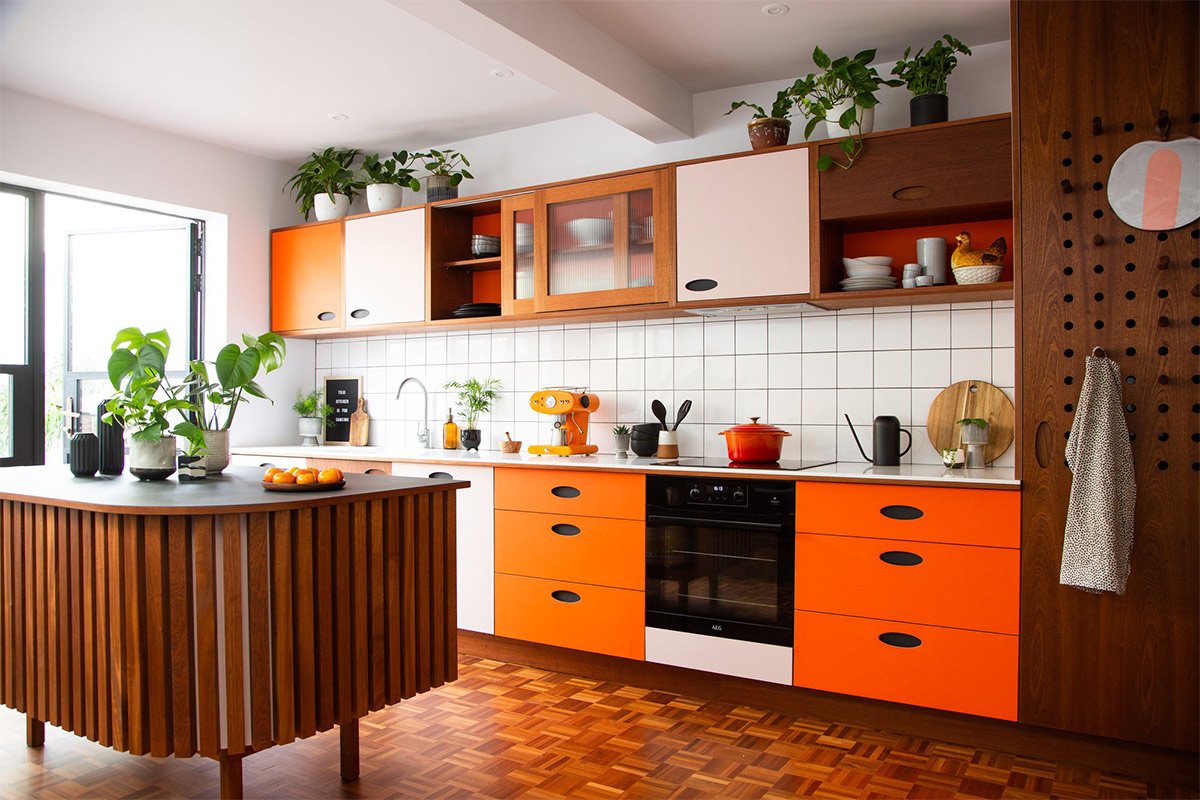
Chromatic Progress: Tech-Infused Opulence
In a tech-driven era, envision deep blues and metallic shades. Midnight navy, electric blue, and metallic accents create a symphony of opulence, aligning spaces with the precision of modernity.

photo: valerie wilcox / design: studio1nine1
In summary, our exploration of color continues - crafting spaces that speak directly to the refined preferences of those who seek not just design, but a purposeful blend of utility and beauty.