
Harmonizing Hues: working with a warm palette
As we delve into the rich spectrum of warm hues, from fiery reds to sun-kissed yellows, we remember that the true mastery lies in strategic interplay of cool notes that accentuate and balance the warmth, creating spaces that resonate with harmony.
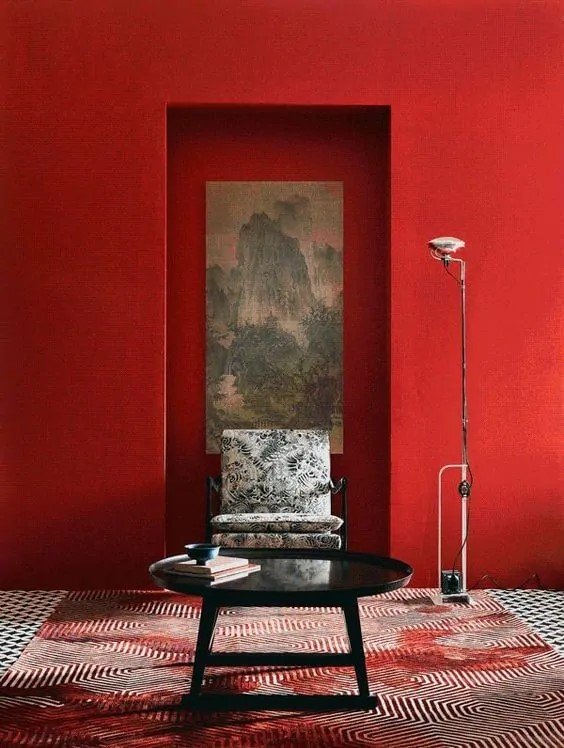
Timeless Brilliance: The Power of Reds
Red, in its various shades, commands attention with unparalleled sophistication. From deep crimsons to muted burgundies, the warmth of red is a deliberate choice, embodying timeless elegance that transcends fleeting trends.
2. Coral Radiance: A Subtle Warmth
Coral hues bring a subtle warmth that speaks to those who understand the art of precision. In our designs, corals aren't just accents; they are calculated choices, creating spaces that radiate understated opulence.

The Sun-Kissed Spectrum: Embracing Yellows and Oranges
1. Golden Grandeur
Golden yellows bring a touch of opulence to any space. Yellow illuminates rooms with timeless grandeur.

photo: rachel whiting
2. Tangerine Finesse
Tangerine, with its boldness and vibrancy, becomes a statement. Tangerine is a deliberate choice for those seeking spaces that exude confidence and style. We look to cool tangerine with a shade of blue as a classic complimentary play.

The Grounded Elegance of Browns
1. Chocolate Luxe

photo: douglas friedman
Deep chocolate browns create a soothing embrace, elegant richness and a timeless allure.