Rich Colour Palettes and Personality Driven Spaces
Colour as Context, Not Decoration
For the past decade, restraint has been confused with neutrality. Grey became a shortcut for taste and white became a default. The result was a generation of interiors that were polite but indistinct.
As we move into 2026, colour is regaining its purpose as a tool for structure, emotion, and clarity. The most relevant work in design right now is not louder, it is simply more deliberate.
Colour is returning to interiors as a way to shape experience, not to fill space.

The Neutral Era Is Ending
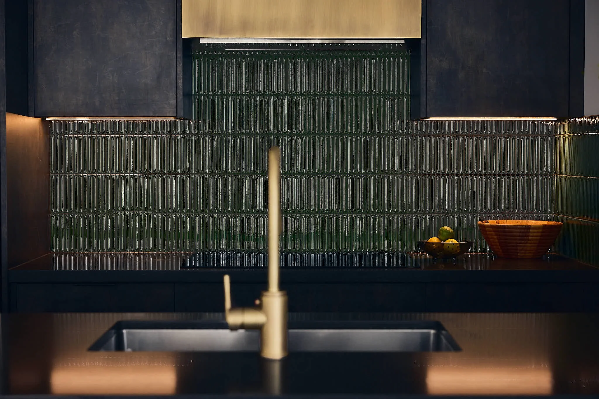
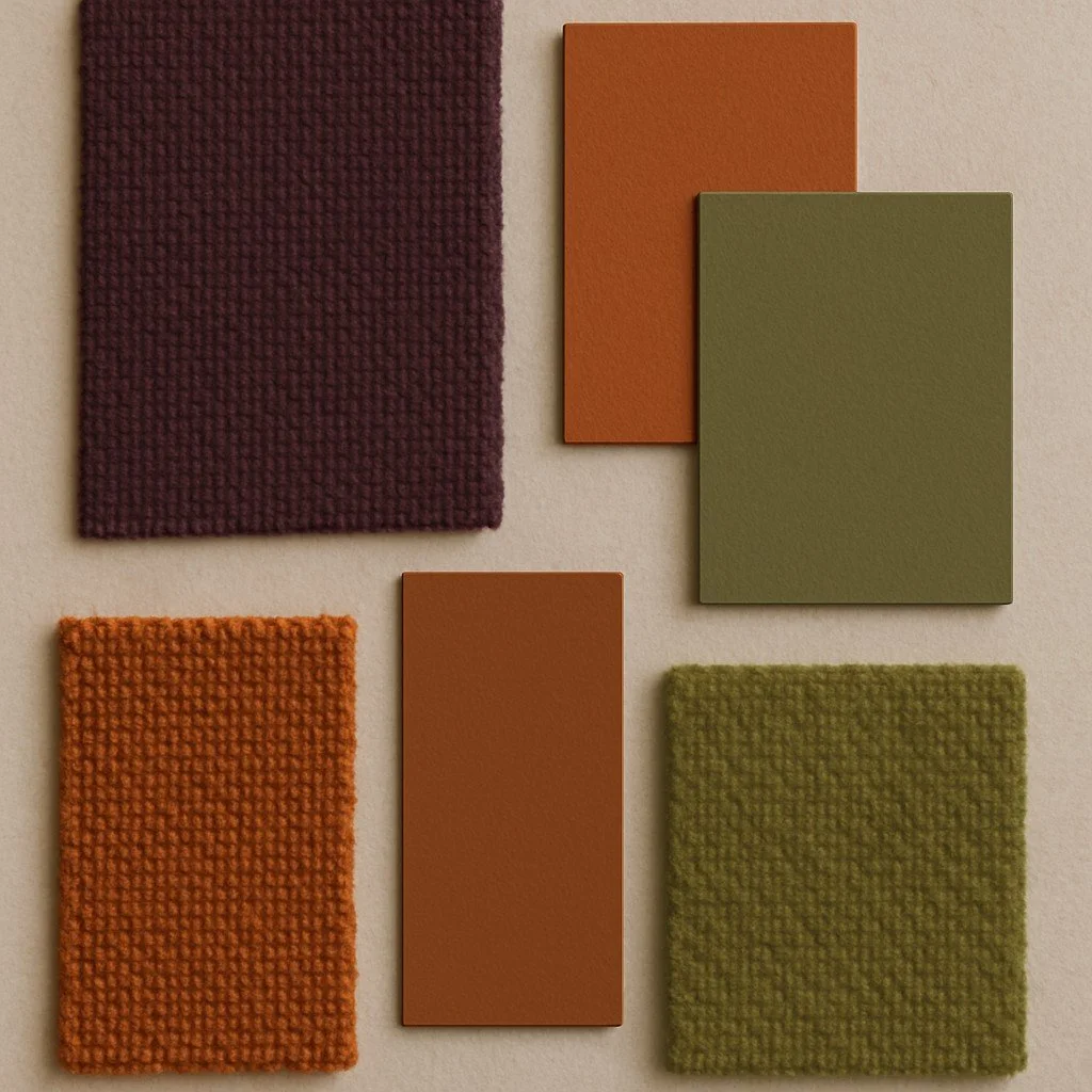
Global design reporting shows a steady decline in cold neutrals and high-gloss finishes. Designers are re-engaging with colour families found in real materials such as umber, olive, sandstone, sienna, and plum.
These tones work because they reference what already exists in timber, stone, and metal. They are not seasonal or synthetic. They make rooms feel grounded without resorting to ornament.
Layering Over Contrast
The current approach to colour is incremental. Interiors are using variations within one family rather than strong contrast. A deep brown wall beside mid-tone timber creates depth without disruption. Muted greens or ochres add character without demanding attention.
Layering in this way keeps the atmosphere consistent while still offering visual rhythm. It is closer to composition than to decoration.
Light as Partner
Colour does not exist without light. Designers are planning both at the same stage. Morning light, artificial light, and seasonal change alter the perception of every surface.
The most successful interiors in 2026 accept that variation. They use it to keep spaces alive. A wall that appears bronze at sunrise may read as taupe under evening light. That change is part of the design, not a flaw.
Working With Colour Responsibly
A few principles define this shift:
Select one leading tone per space, drawn from a natural material.
Support it with two or three tones of similar value.
Avoid synthetic pigments that distort under changing light.
Test samples on site before specifying.
This method produces consistency across projects without defaulting to neutrality. It allows colour to serve architecture rather than compete with it.
Colour is not making a comeback. It never left; it was simply over-edited. The new conversation is about control, purpose and how tone, light, and material combine to shape how people live.
At Studio 1NINE1 we see colour as part of the architectural framework, not an afterthought. The palette defines rhythm, guides perception, and connects the physical with the emotional.
The aim is not to follow trend but to design with clarity. That is what makes a space feel resolved.