
Why Your Renovation Doesn't Look Like the Magazine
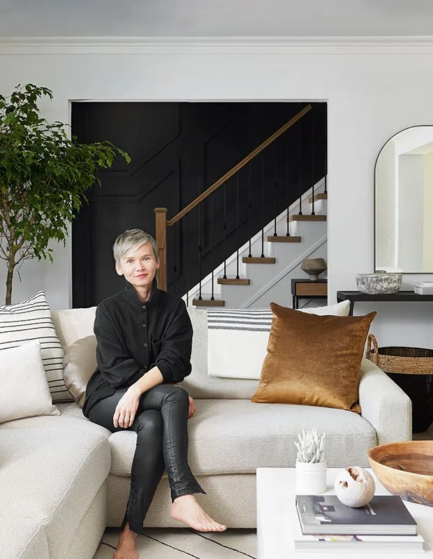
Almost everyone who renovates keeps a folder. Sometimes it lives on Pinterest, sometimes in a stack of torn pages, and lately it is a few hundred screenshots that arrive with the first email. We love seeing them, because they tell us what someone wants to feel in their home long before they can put it into words. They also explain a particular kind of disappointment, the one where the renovation is finished, the money is spent, and the house still looks nothing like the folder.
The usual explanation is budget, and sometimes that is true. More often, the homes in those images and the renovation that disappointed cost something comparable. What separates them is a set of decisions the photograph doesn't show you, because a good photograph shows the result of a decision and hides the decision itself. You see a calm kitchen. You don't see the person who decided there would be only three materials in it, or the drawing that took the upper cabinets all the way to the ceiling so there was no dusty ledge above them, or the hours spent working out that the island should be four inches narrower than the plan suggested.
We have come to think of a magazine image as a kind of evidence. If you learn to read it, it tells you how it was made, and that changes what you ask for.
Start by counting materials. Look at a room you love and name every surface: the floor, the counters, the cabinet fronts, the walls, the hardware, the tile. In the images people save most often, the count is surprisingly low, and the same material often repeats in more than one place. Then look at your own finished room or your builder's selection sheet and count again. A long list is usually the first sign that choices were made one at a time instead of as a set.
Next, look for the light. In a well-designed room you will rarely find the source of most of the light, because it is hidden in a cove, under a shelf, behind a valance or inside a cabinet. What you see is a glow on a wall or across a counter. If the light in your room comes mainly from a ceiling grid, that difference accounts for more of the gap than any finish.
Then look at the edges, the places where one thing meets another. Where does the cabinetry stop against the ceiling? How does the tile end beside a window? What happens where the floor meets the stair? In the folder images, those meetings are clean and deliberate, because someone drew them. In most renovations, they were decided on site by whoever happened to be installing that day.
Finally, notice what isn't there. The images we all save tend to be edited rooms, with fewer objects, fewer patterns and fewer competing ideas. That restraint was a design decision too, and it is often the hardest one for people to make on their own, because each individual thing they love is genuinely lovely.

None of this is about having better taste. The people who send us their folders have a sense of what they like; that is why the folders exist. The difference is that the rooms in them were designed as wholes, with every decision made in relation to the others, before anything was ordered.
If you have a folder and a project ahead of you, try this exercise with your three favourite images. And if you would like a second pair of eyes on what those images have in common and what they would ask of your own space, that is exactly the conversation our video consultations are built for.