
The Difference Between Aging and Wearing Out
There is a category of finish that looks best on delivery day and slightly worse every year after that. There is a smaller, more interesting category that looks better in year five than it did in year one. Most renovation conversations do not distinguish between the two, and that is where a lot of five-year-old kitchens go quietly wrong.
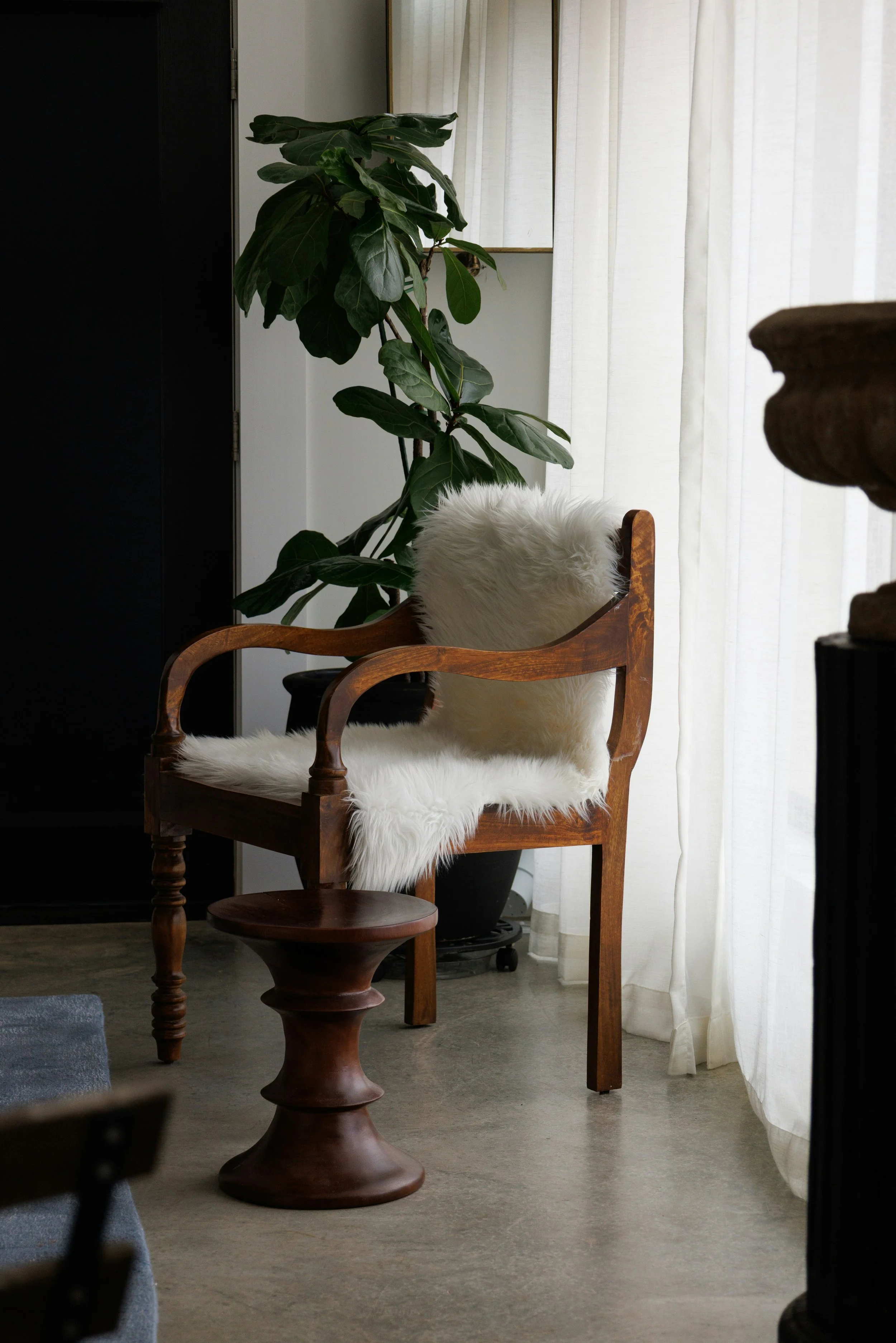
Unlacquered brass is the clearest example. Install it and it is bright, almost too bright, the colour of a doorknob in a rental building. Six months in, fingerprints and moisture start to soften it. Two years in, the high-touch areas, a tap handle, a cabinet pull, have gone a warm, uneven amber while the surfaces nobody touches stay closer to their original colour. The unevenness is the entire point. A client who lacquers their brass to keep it looking new is fighting the one property that made the material worth specifying in the first place.
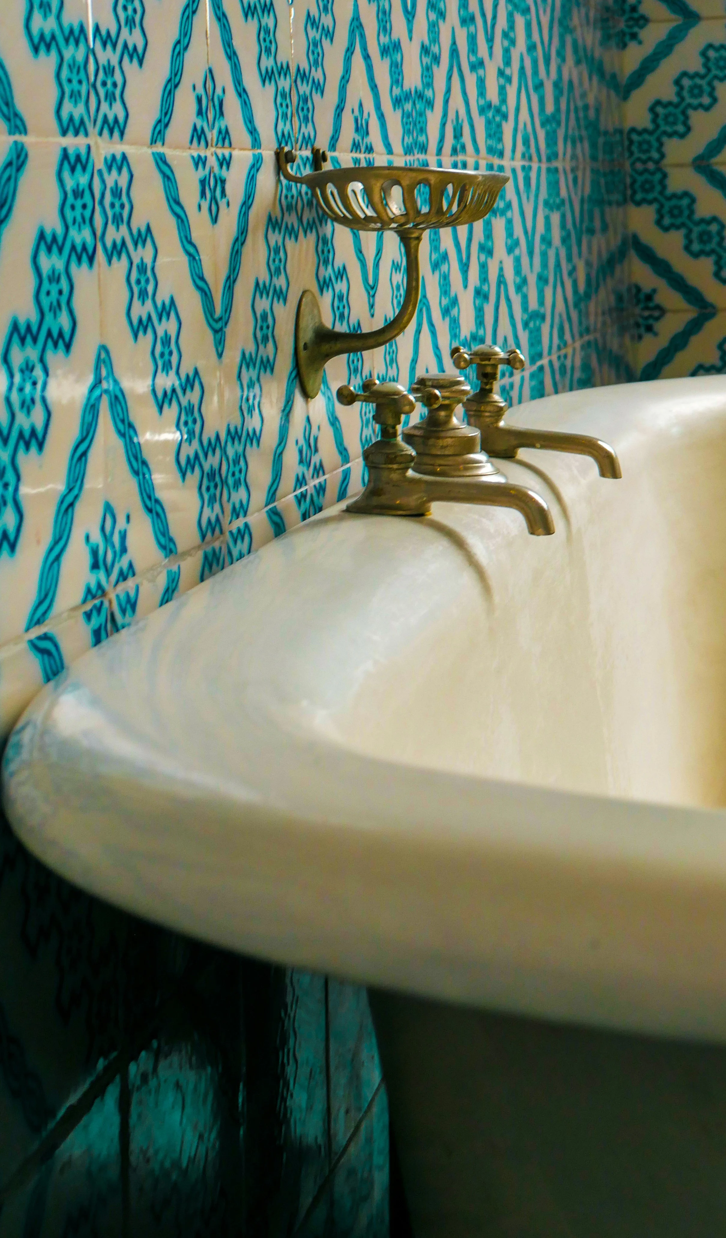
White oak does something similar with light and use. Left unfinished or oiled rather than sealed under polyurethane, it ambers and deepens wherever sun and foot traffic hit it hardest, which means a floor develops something close to a use-map over a decade: worn in front of the sink, at the island, at the back door where the boots come off. An engineered product with a printed wood-grain layer does not have this behaviour available to it. It looks the same at year ten as it did on install day, which sounds like an advantage until you notice that sameness is also flatness.
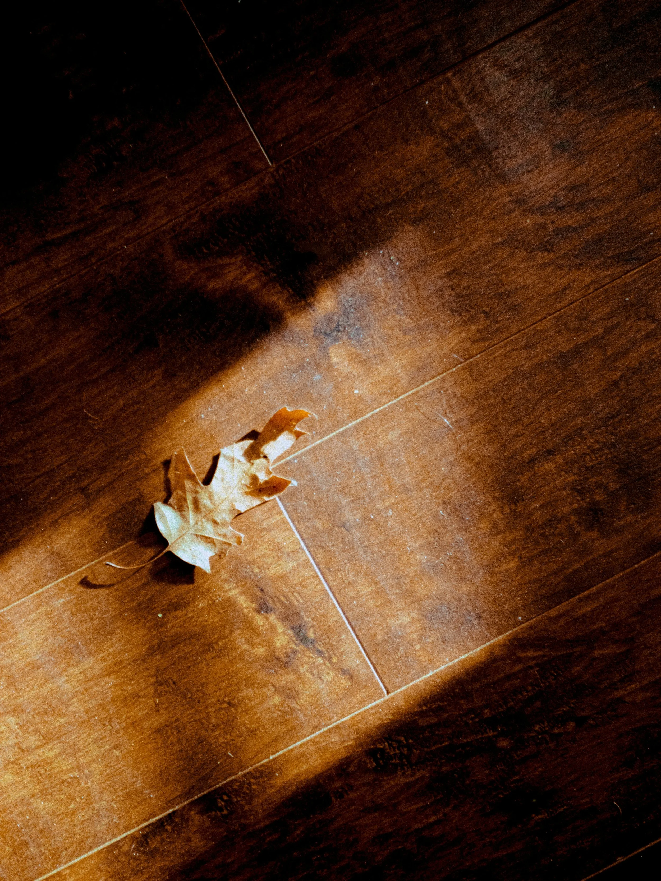
Lime plaster and lime wash walls belong in the same family. They take light differently than drywall from the first week, a slight variation across the surface instead of a dead-flat plane, and that variation only gets more legible as the wall picks up small imperfections over years of a house being lived in. A patch or a scuff reads as texture rather than damage, because the wall was never claiming to be perfect.
Set those against a few materials that do not age the way people hope. Quartz composite countertop resists staining well and holds its colour, but it does not develop character with use. It develops chips at the edges and a slightly duller sheen where years of cleaning chemicals have worked on the resin binder. It wears; it does not age. Powder-coated steel does the same thing outdoors through a Toronto freeze-thaw cycle: it holds its colour until the coating fails at a scratch or a seam, and then it fails all at once, peeling rather than fading. There is no graceful middle state to either material, and that is not a criticism. It is a fact worth knowing before you specify one.
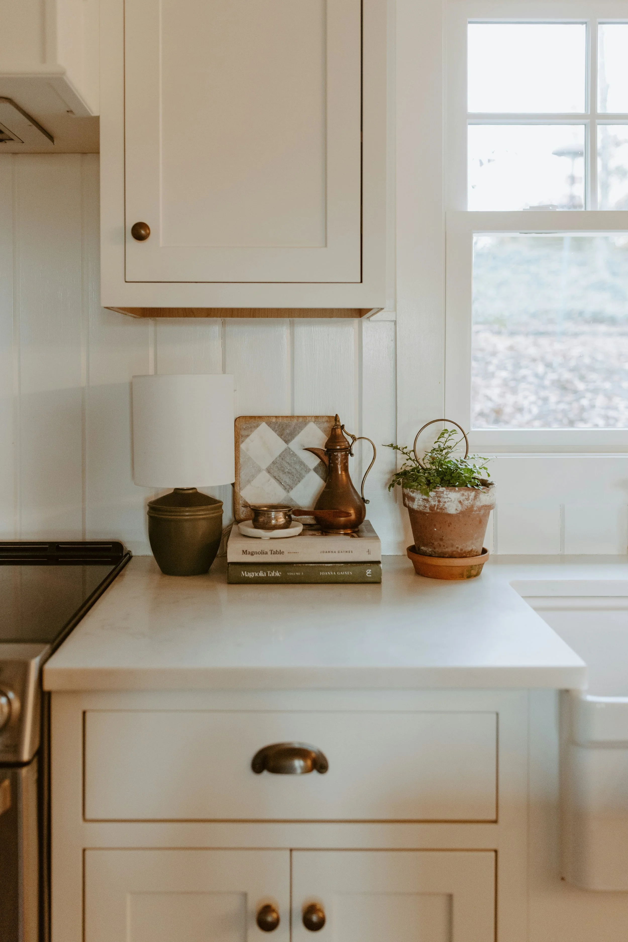
None of this is a hierarchy of good and bad materials. A quartz counter is often the correct choice for a busy family kitchen precisely because it does not need to age gracefully, it needs to survive a decade of daily use without a maintenance conversation attached to it. The mistake is not choosing quartz. The mistake is choosing any material for how it looks in a photograph and being surprised, three years later, by how it actually behaves against a family.
It is also why we push clients toward a physical sample under real light before they commit to anything, not a rendering. A rendering has no time built into it, so it cannot show you what unlacquered brass looks like after two years of real use. Photographs of finished projects have a smaller version of the same problem. If you are researching a material for your own project, there is one direct question worth asking whoever is selling it to you: what does this look like in year five, not year zero. If they cannot answer, that is useful information too.

We specify for how a room gets lived in, not just for how it looks on the day the crew leaves. That distinction shows up first in the materials, because the materials are the part of the room that keeps changing long after everyone else has moved on to the next project.